Typr
Typr - Devlog 4
Hi again folks, Andrew here with the fourth devlog on the game Typr, my brand new project.
For information on what Typr is you can check out the main page here on itch.io, it gives a good representation of what I'm trying to build and hopefully those extravagant devlogs will keep you around!
Links
Discord Server for Active Development: https://discord.gg/nArn9Mk
Facebook page: https://www.facebook.com/altraydigital/
Twitter: https://twitter.com/AltRayDigital
Email: altraydigital@gmail.com
Preface
This week (and a bit, sowie, been quite busy with university) I split the game into modules. For the first module I chose the main menu and I worked on it extensively.
Main Features
- Solidified the game's aesthetics
- Implemented game intro
- Implemented main menu animations
Aesthetics
The very term frightens me. Since I tend to lean on the programming side of things aesthetics are usually the last thing I think about.
Typr is a game about, well... typing and so there are a few principles I have to stick by when working on the game's aesthetics. First of all, the text must be readable, not only that but it must be easily readable and not give the player a headache when he tries to make out what it's written on the screen. Even though I planned on working on the main menu only I soon found out that the aesthetic of the menu plays an important role in how the rest of the game looks so I took some time to nail it down.
So I started going through the fonts in search of the best one and after hours of comparisons I found out that even some of the best fonts like Times New Roman have faults and sometimes even I couldn't quickly decipher what was written on the screen or I simply typed in "l" instead of 1 by mistake. In the end I settled for the classic Arial, it seemed the best option out of everything else for a typing game.
Next up, I had to figure out what color the text should be. Well black background and white text, of course, I hear you saying but its not as simple as that. I wanted to go with black and white too but it is so simple and it becomes so boring after a while to only look at black and white so I thought why not give it a bit of color.

First off I implemented different backgrounds for every time the word (in gibbrsh) or the paragraph (in classic) changes. They will randomly change colors (colors that I have chosen deliberately). And so with the background changing I also needed the text color to change depending on how dark the background is.
I've decided on having two colors that will highlight the text that the player has to type in. Orange for the dark backgrounds and blue for the light background (these colors are complementary). All the other text is either black or white except for the words that the player has to type in.
This gives the game some variety when it comes to the levels and its not just two bland colors on top of each other.

Intro
I love the company logo and I had to put it in as splash art during the game's intro. So every time you start up the game you'll see the logo and you can skip ahead using any key on the keyboard to the main menu instantly (as long as the assets have loaded before).

Main Menu
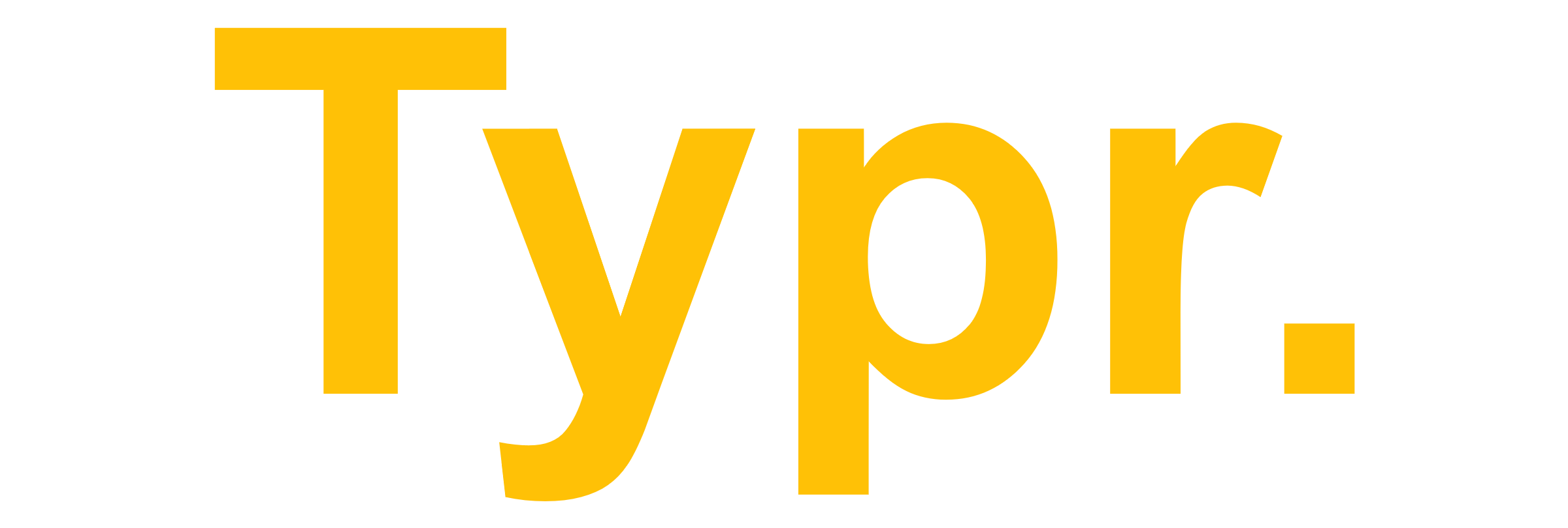
After I nailed down the way the game would look I took the main menu and decided to make it pretty. While at first I loved the game's logo, over time I simply wouldn't care for it. I needed something simple, something easily readable and something that will give off the right impression on what kind of game this is. So yes you guessed right, I went with Arial again, bolded the letters and for the color I chose the same color that highlights the words (orange) on dark backgrounds. I've also added animations for both logo and menu that give a bit of flair to what was otherwise pretty boring.

As you can see from the trello plan, I wanted to also do a few sounds for the main menu but alas it was too much and I had to leave it for next week.
Conclusion
Unfortunately as you may have noticed I've already missed the deadline for this devlog by about 2 hours. I'm swamped right now with both work and university projects but I will do my best to keep this series of devlogs going as well as the development of Typr. Next week we're finishing the main menu with sounds as well as dive deeper in the color palette of the levels!
This marked the end of the fourth week of development!
Thank you for reading and see you next time,
Andrew
Leave a comment
Log in with itch.io to leave a comment.